LEBEC
An innovative finance platform that needed a site as serious as the work, without looking like every other firm in the room. We rebuilt it from a slow Squarespace into a fast, editorial site that finally looks like them.
The story
LEBEC is Alix Lebec's company. She spent twenty years moving capital toward things that usually struggle to get funded, water, climate, and the people building real solutions in places most investors overlook. In 2020 she started LEBEC to do that work on her own terms. She is also my fiancée, so this project was a personal one.
The company lives in a space most people do not have a clean word for. It is not a traditional foundation, and it is not a traditional finance firm. It sits in between, helping people blend the two so money can actually move. The hard part of the brief was making a website that feels like that in between space, calm and trustworthy like finance, but warm and human like the mission behind it.
When we started, the site was on Squarespace. It worked, but it was slow and it was awkward to update. It also looked like a lot of other sites in the category, and LEBEC is not like a lot of other companies in the category. So we rebuilt it.
The reason we built it in code, instead of inside a website builder, matters more than it sounds. Squarespace keeps you inside its own box. You get what it hands you, and not much more. When the site is built in code, we can add almost any technology we want.
If LEBEC ever wants a rich, interactive chart to show where capital is moving, we can build one with D3.js, a tool for turning raw numbers into custom visuals you can actually explore. The moving brand patterns you will see further down are made with p5.js, a tool for drawing and animating graphics right in the browser. On Squarespace you would be fighting the platform to bolt something like that on. Here, it is native, so it just works.
Before and after
Here is the homepage they had, next to the one we built. I want to be fair to the old one, because the hero still had something I liked. It just left too much unsaid. You could land on it and not be sure, right away, what LEBEC actually does. The new version keeps that calm feeling and adds the context that was missing, so you know where you are within the first few seconds.
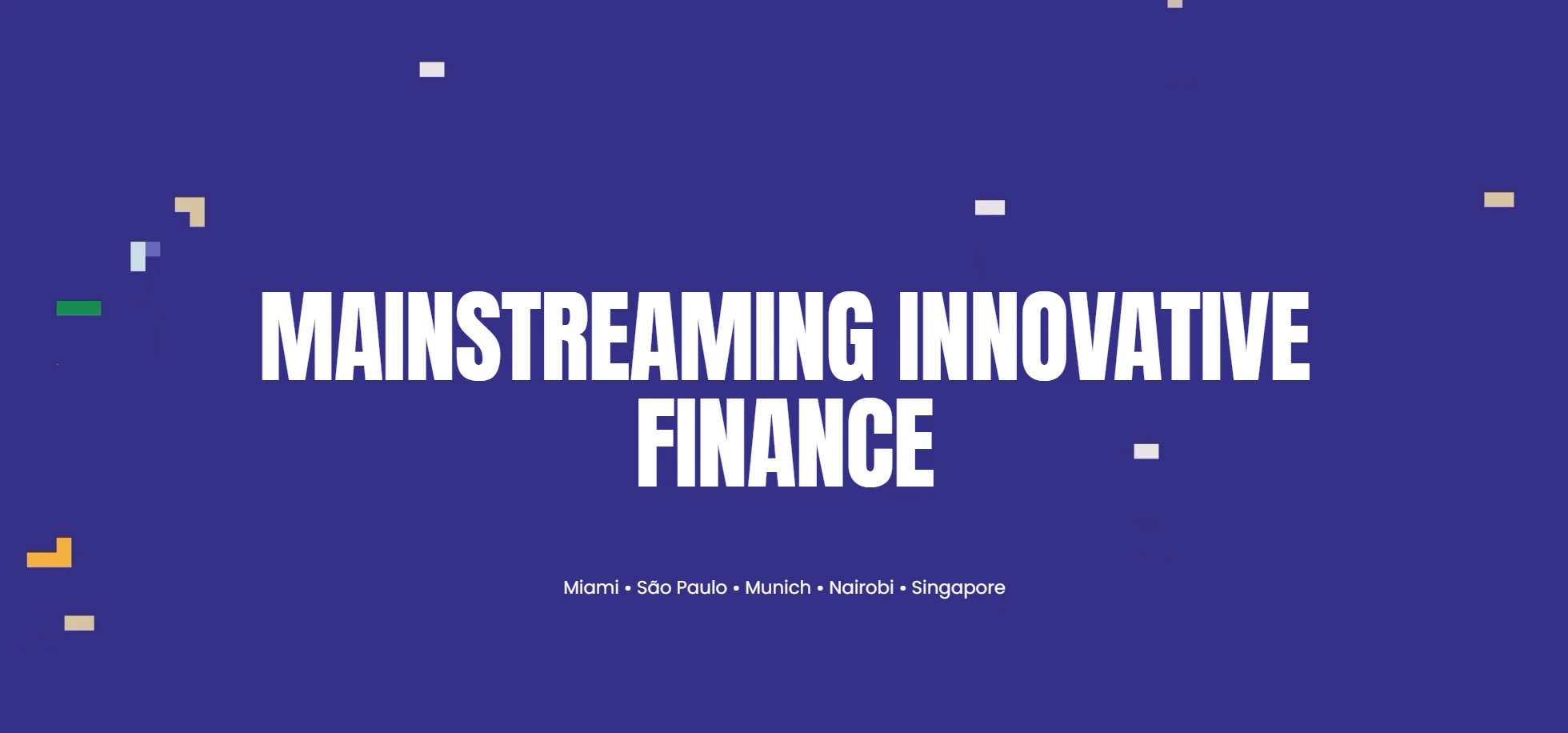
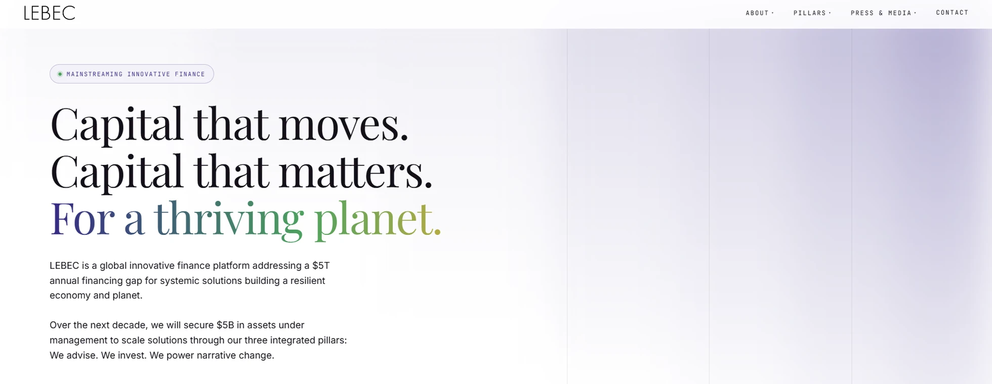
One change worth pointing out is how we show the companies LEBEC has worked with. The old site ran their logos through a carousel that just slid past. You would catch a logo, maybe recognize it, maybe not, and you would have no idea what that company actually does. On the new home page, all of those logos sit in one grid, so you can take them in at once. Hover over any of them and it tells you the industry they work in, like agriculture, education, or conservation. So instead of a row of names you might not know, you get a quick sense of the kind of work LEBEC is part of.
Something else you might notice as you scroll through either page is a technique called scrollytelling. It just means the page reveals itself as you move down it. Sections fade and slide into place, and the story unfolds at the pace you scroll, instead of landing on you all at once. Both pages lean on it, along with a few other subtle animations, and it is deliberately quiet. Nothing flashy, nothing in your way. It just makes the site feel a little more alive and immersive, like something built with care rather than dropped into a template.
The reason I reach for this is simple. LEBEC is telling a real story, and a page that moves with you holds attention better than a flat wall of text. Motion, used lightly, guides the eye, gives each section room to land, and quietly signals that someone actually thought about how the page should feel.
Rebuilding the articles and press page
LEBEC publishes a lot. Op-eds, interviews, podcast episodes, press features. That page carries a lot of weight, so it was worth rebuilding properly. Here is the old version next to the new one.
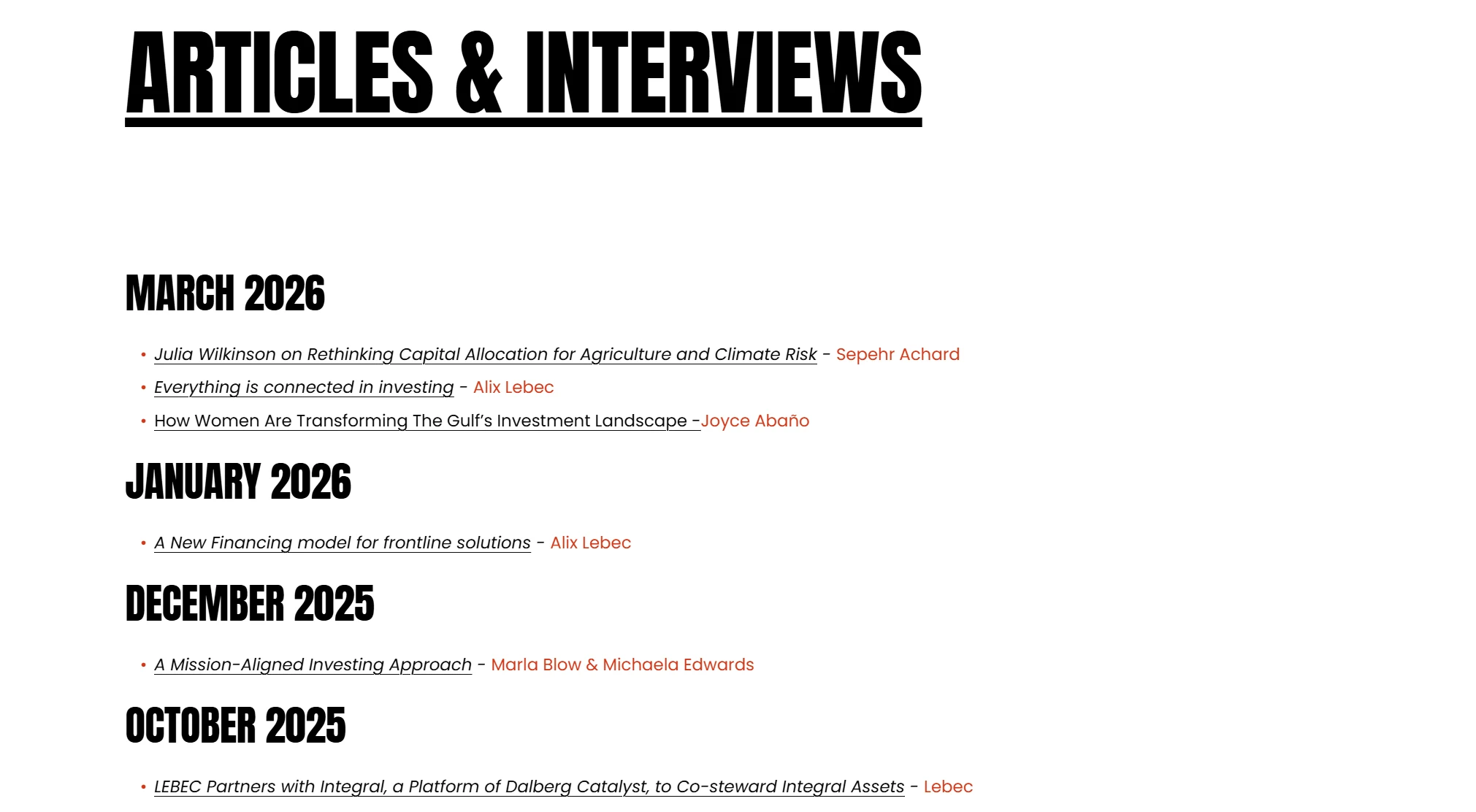
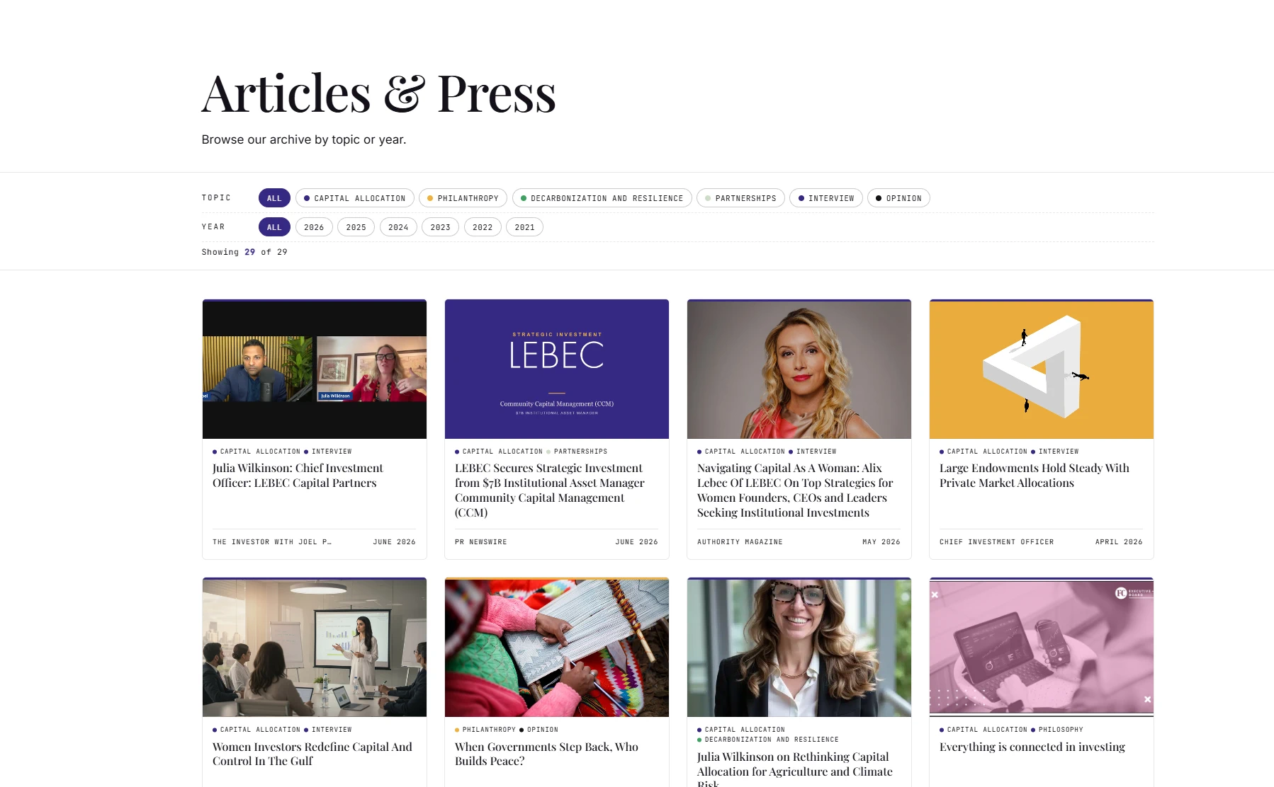
The old page was basically a wall of text. A long list of links, organized by date, that you scrolled through and read line by line. If you did not already know what you were after, it was hard to find anything.
The new one works more like a library. You can filter the list, and you can browse by category, so you can go straight to the interviews, or the op-eds, or the press. Every item also has a thumbnail, so you get a small preview of each piece before you click. That bit of context up front makes the whole page easier to explore, instead of a stack of links and dates.
Where LEBEC has been
LEBEC travels a lot. Alix and the team speak at conferences, host private dinners, and gather people for group discussions and events all over the world. That travel is a real part of the story, so it deserved more than a footnote.
The old site showed all of this as a grid of photos. It looked nice, but it did not tell you much. You could see that something happened somewhere, without a clear sense of where, or how far the work actually reaches.
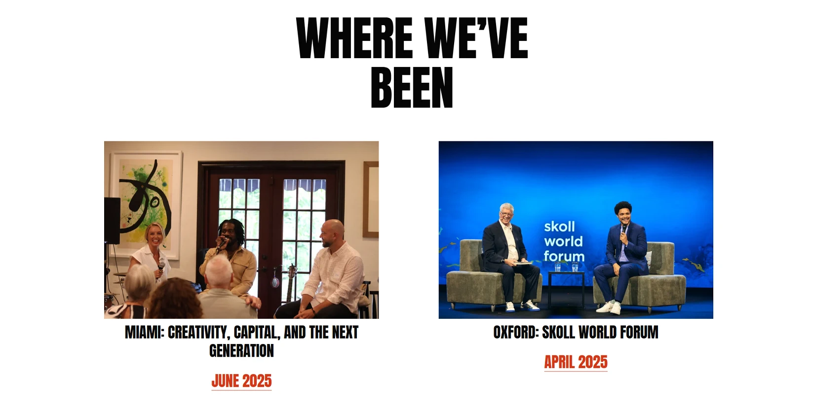
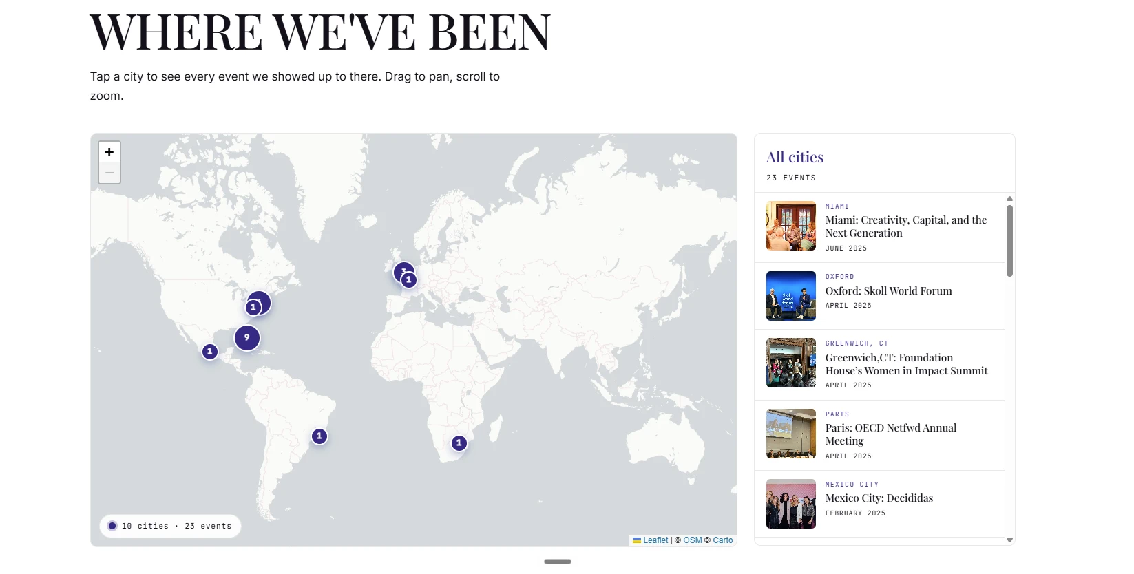
On the new site, that same history lives on an actual map, built with Leaflet. Every place LEBEC has shown up is marked on it, so in one glance you can see the reach. New York, London, Oxford, Paris, Mexico City, Johannesburg, and more. It turns a wall of photos into a story about presence, which is really what it is.
The design system
Before building pages, I built a small system. A set of colors, type, spacing, and motion that every page pulls from, so the whole site feels like one thing instead of a stack of one-off layouts. Here is the short version of it, in LEBEC's own brand.
The LEBEC Design System
Editorial, calm, and confident. Built to sit in the space between philanthropy and finance.
1. Color+
#362983Primary. Dark grounds, headings.#3FA162Secondary accent.#EFB142Highlight and calls to action.#E7E2E8Light accent.#CFDFE8Light accent.#CEDDC7Light accent.#F6F1E8Page background.#141119All body and label text.Every brand color is generated into a full scale, six tints and six shades around the base. Here is Royal Blue, light to dark.
Lightest tint on the left, base in the middle, darkest shade on the right.
All body, label, and secondary text is Ink. There is no light gray text. Lighter text only appears on dark or royal blue grounds, using Ivory or Lilac.
2. Typography+
LEBEC harnesses innovative finance and technology to unlock assets for a resilient, thriving economy and planet.
Body copy runs in Inter at a comfortable reading size, with a line height set for long form thought leadership rather than quick scanning.
Caption and label text
3. Spacing and rhythm+
Instead of a one size fits all spacing scale, the gaps are named for what they sit between. A heading sits closer to the paragraph it introduces, and further from the paragraph above it. That small idea is what makes long pages read like an article.
| Token | Use | Value |
|---|---|---|
--gap-p-p | Paragraph to paragraph | 1rem |
--gap-h2-p | H2 to paragraph | 1.25rem |
--gap-h3-p | H3 to paragraph | 0.75rem |
--gap-p-h2 | Paragraph to H2 | 3rem |
--gap-p-h3 | Paragraph to H3 | 2rem |
--section-y | Section vertical | clamp(4rem, 8vw, 7rem) |
--section-y-lg | Section vertical, large | clamp(6rem, 12vw, 10rem) |
4. Generative art+
This is the part that makes a finance site feel alive. Instead of stock photography, the brand has its own set of patterns, drawn in real time with p5.js on a royal blue ground. They breathe and shift, slowly, so the page never feels static. Each one below is running live, with the code that draws it right next to it.
Built with
The new site is a static site, built once and served as plain files, so it loads fast and stays simple to run. Here is what it runs on, and why each piece is there.
| Tool | What it does here |
|---|---|
Astro | The framework. Builds the whole site into fast static pages, no heavy app to load. |
Tailwind CSS | The styling layer, tied to the brand colors and spacing tokens above. |
p5.js | Draws the live generative patterns and the pillar animations. |
GSAP | Handles the small motion. Hover states, link underlines, and scroll reveals. |
D3 | Powers the charts, for showing figures like assets and impact. |
Leaflet | The map on the events page, plotting where LEBEC has been around the world. |
Netlify | Hosting. The built site is deployed here and served from a global network. |
Want a site like this?
I take on a small number of brand and site projects each year. If you have a business that deserves better than a template, let's talk.
Start a project