A&O Premium Locksmith
A 24/7 mobile locksmith in Miami-Dade with a brand that doesn't look like every other locksmith on Google, and a tracking feature no other locksmith in town has.
The story
Arellys and Oscar are two of my oldest friends. So when Oscar started building out his own locksmith business, I wanted to help him launch with something real, not a logo slapped on a template.
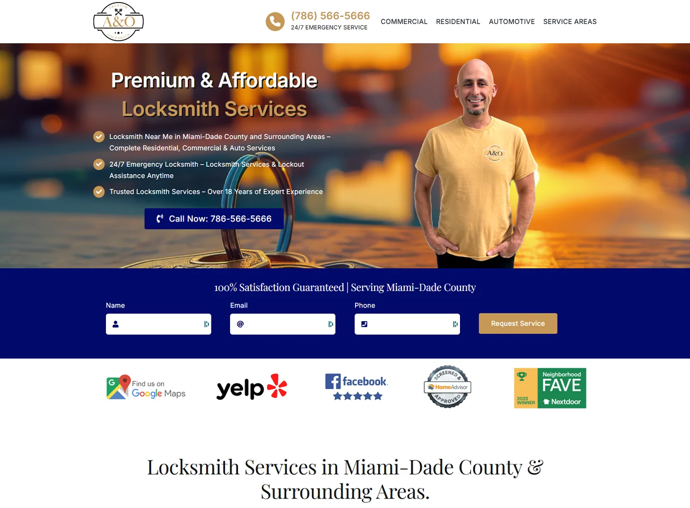
When he showed me his existing site, I took one look and told him, "the 90's called, they want their website back." He laughed. Then we got to work.
Knowing Oscar for as long as I have, the brief was easy. He genuinely cares about giving people a good experience, even on what is usually the worst day of their week. He's funny, he's warm, he's the kind of guy you would trust with a key to your house. The brand had to feel like that. Friendly. Approachable. Nothing corporate, nothing cold.
So I built it as a gift.
Before and after
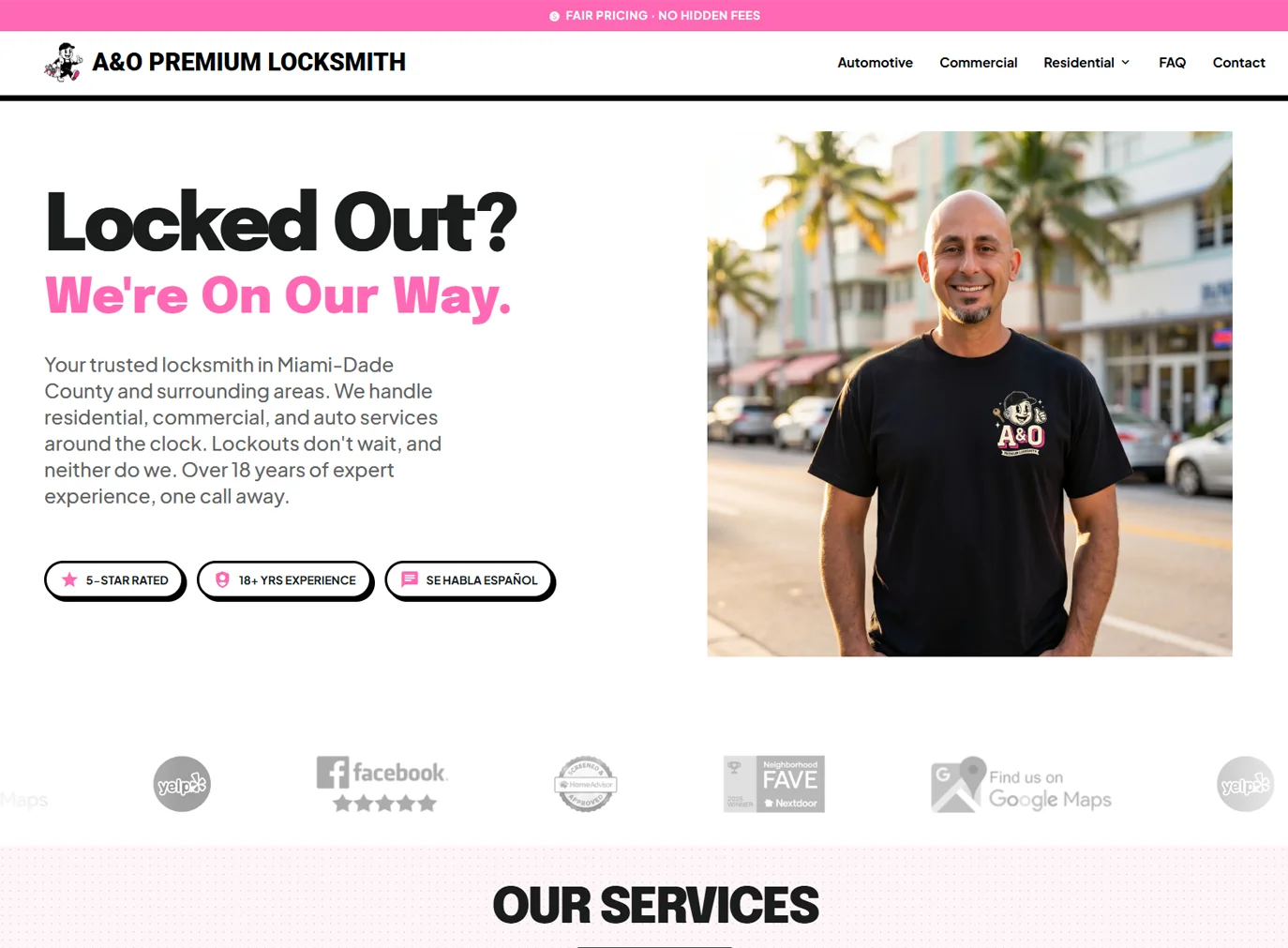
Here's what they were working with, and where we landed.
The design system
I built a small set of primitives and used them everywhere. Hand-lettered ink contours, solid offset shadows, pill buttons that press in when you tap them. The whole thing leans rubber-hose cartoon, with a pink-and-black palette that separates them from the generic blue-and-yellow locksmith look.
The Inkwell Kinetic
Design System for A&O Premium Locksmith
1. Creative North Star+
Not This
Cold, industrial, sterile. Generic locksmith template with stock photos and thin gray lines.
This
High-energy, hand-crafted, alive. A cel-animated performance meets modern utility. Trustworthy but fun.
The Vibe
If a 1930s cartoon character opened a locksmith business and hired a modern designer to build the website.
2. Color Palette+
Hot Pink
#FF69B4
Primary Container
CTAs, accents, brand moments
Deep Pink
#AC2471
Primary
Links, hover, text accents
The Ink
#000000
On Background
Text, borders, shadows
The Paper
#FFFFFF
Surface Lowest
Cards, containers
Backdrop
#F9F9F9
Page background
Surface Low
#F3F3F4
Section bgs
Surface Variant
#E2E2E2
Nested blocks
The Shadow
#646464
Secondary text
#25D366
WhatsApp ONLY
#FFF5F8
#FFE0EC
#FFB0D0
#FF8DC0
#FF69B4
#E84DA0
#D1368C
#AC2471
#8C0058
#3D0024
#FFFFFF
#F9F9F9
#F3F3F4
#E8E8E8
#E2E2E2
#C6C6C6
#646464
#000000
3. Typography+
Logo / Brand Mark
Roboto · Black 900
A&O PREMIUM LOCKSMITH
Headlines & Display
Epilogue · 700 / 800 / 900
Locked Out?
We're On Our Way.
Our Services
Commercial Locksmith
Body & UI Text
Plus Jakarta Sans · 400 / 500 / 600 / 700
24/7 Emergency locksmith services for your home, car, and business. Our certified technicians bring professionalism, precision, and peace of mind to every job.
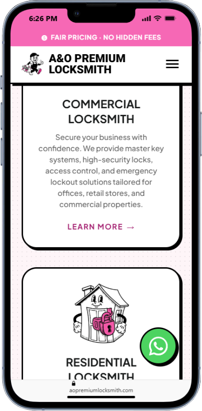
Secure your business with confidence. We provide master key systems, high-security locks, access control, and emergency lockout solutions.
© 2026 A&O Premium Locksmith, LLC. All Rights Reserved.
4. Elevation & Depth+
Small Shadow
4px 4px 0 0 #000
Cards, badges, nav buttons
Large Shadow
8px 8px 0 0 #000
Hero CTAs, mascot frame, featured cards
Pressed / Active
Shadow removed plus translate 4px
Button click state
Rule: No Soft Shadows
Any use of blur-radius in CSS box-shadow is a system failure. All depth is achieved through solid black offset and tonal layering.
5. Components+
Primary CTA
Pink fill, white text
Secondary CTA
Black fill, white text
Tertiary
White fill, black text
WhatsApp Only
#25D366 exclusive
Residential Locksmith
Protect what matters most. From lock changes and rekeying to smart lock installation and home lockouts.
Learn More →"Amazing locksmith service! Oscar was professional, on time, and very knowledgeable."
Gabe OlivaresVariant A. Checkmark.
Rekey every exterior lock.Front, back, garage side door, patio. Cheaper than replacing.
Replace the mailbox lock.Identity theft starts here. Fastest upgrade on the list.
Variant B. Numbered.
Call or text us first.The sooner you call, the sooner you're rolling.
Move to a safe spot.Get to shade, a storefront, or somewhere you can wait comfortably.
6. Textures & Patterns+
Halftone Dots
Radial gradient dots at low opacity over light pink. Used on services backgrounds and secondary content to evoke vintage comic printing.
Ink Contour Border
Every card, button, and container gets a 2 to 3px solid black stroke. Never use 1px borders. Mimics a hand-drawn brush line.
7. Do's & Don'ts+
Do
- check_circleExaggerate. Bubbly corners, ink-heavy lines.
- check_circleUse halftone dots on secondary sections.
- check_circleUse solid offset shadows exclusively.
- check_circleKeep corners rounded. Minimum 8px radius.
- check_circleReserve green (#25D366) for WhatsApp only.
Don't
- cancelNo soft or blurred shadows. Ever.
- cancelNo sharp corners. Everything is rounded.
- cancelNo 1px borders. Minimum 2px stroke.
- cancelNo horizontal rule dividers inside cards.
- cancelNo stock photography. Only mascot and icon art.
Iconography
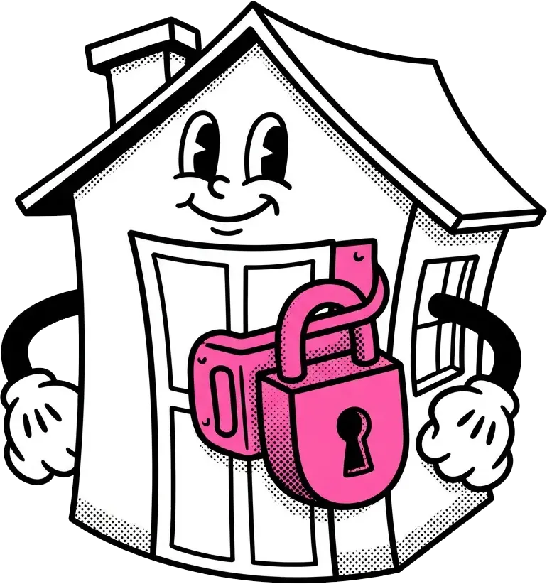
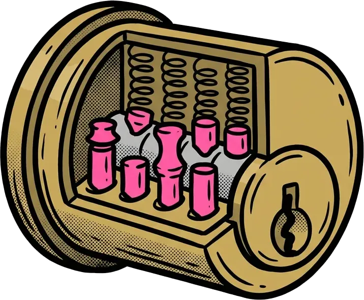
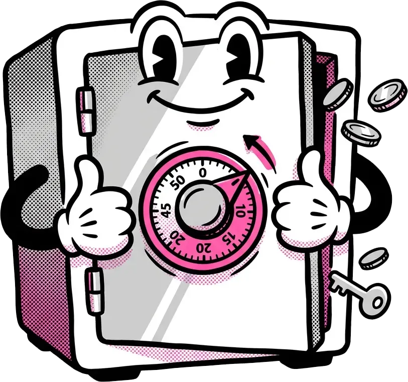
Every service category got its own little character. The icons keep the same hand-drawn feel as the rest of the system, with the pink accents pulling the whole brand together. They sit at the top of each service card and on the homepage grid, so the page never has to lean on stock photography.

The signature feature: a live tracking link
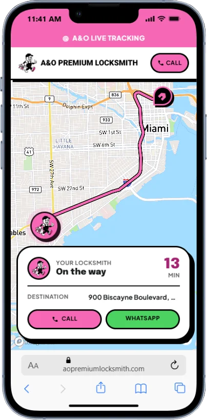
This is the part I'm proudest of. When a customer calls in for help, Oscar can hit Start on his phone, generate a short URL, and text it to them. They open it and watch his van move toward their address on a live map, with an ETA that updates every 30 seconds.
Customer calls. Oscar opens his dispatch app and types the address.
The app confirms the location and creates a short URL like /t/abc123.
Oscar texts the link. The customer taps it and sees a live map.
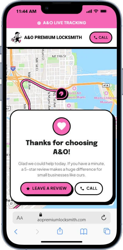
When Oscar pulls within 75 meters, the page swaps to an Arrived card.
This isn't just graphic design. It's service design too.
Most locksmith calls come from someone locked out of their car, someone whose house just got broken into, or someone sitting on a curb at midnight. The tracking link is there to ease that anxiety, a small visual reminder that help is actually on the way.
The WhatsApp button
There's a green WhatsApp button anchored to the bottom-right corner of every page, and it's the only thing on the entire site that uses that color. Everywhere else is pink, black, and white. Drop a WhatsApp green into that mix and it doesn't blend in, it announces itself. Your eye finds it before you've finished reading the hero. Even if you've never been to the site before, you know exactly where to tap.
The other reason is cultural. A huge share of Miami is Latino, and for a lot of us, WhatsApp isn't just an app, it's the app. It's how we talk to our parents, our cousins back home, our friends from high school. Putting it next to Call and Text isn't a cute gesture, it's meeting people where they already are.
Built with
No build step, no bundler, no framework tax. Just static HTML, Tailwind, and a couple of tight integrations.
| Tool | What it does here |
|---|---|
HTML | The whole site. Plain static HTML, no framework and no build step. |
Tailwind CSS | The styling layer, tied to the brand colors and the ink-and-shadow system. |
Mapbox GL JS | Powers the live tracking map, the route line, and the ETA that updates as Oscar drives. |
Leaflet | Draws the service-area map on the homepage, kept separate from Mapbox to stay in the free tier. |
Supabase | The database, login, and realtime updates behind the tracking link. |
Netlify | Hosting, plus the short link redirects like /t/abc123. |
Want a site like this?
I take on a small number of brand and site projects each year. If you've got a business that deserves better than a template, let's talk.
Start a project