Every slider is a decision
I love the systems side of graphic design: grids, type, layouts, and the rules that hold them together. So instead of designing backgrounds one at a time, I wanted to design the system that makes them. A single tool where every look can be pushed, tweaked and exported in any shape, as often as I want.
What a Lab is
I call these small tools Labs. Each one is a custom built, single page app, made with Claude Code, that does one creative job. Every Lab gets its own look and its own controls. Only the plumbing carries over from one to the next, things like exporting files and saving settings.
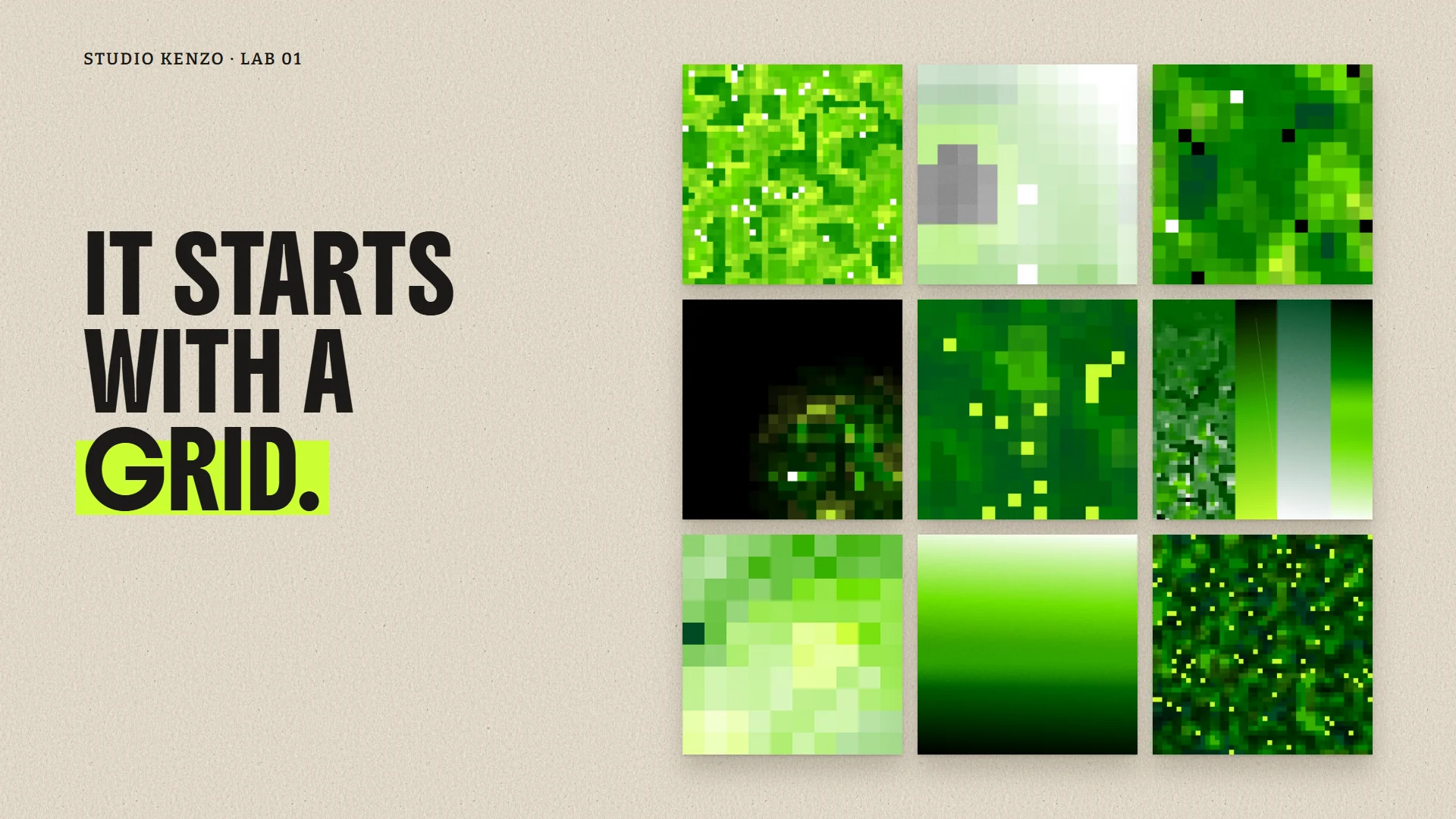
This one makes backgrounds. Panels of grained gradients and pixel mosaics, exported as 4K stills, transparent overlays and seamless video loops.
Structure first
Before anything looked good, the system had to be organized. Three rules hold the whole thing together:
- Colors are numbered slots. A composition points to color 3, not to a specific green. Paste in a new palette and everything recolors at once.
- Every loop joins itself. All motion completes full cycles, so the last frame meets the first and the video never jumps.
- One folder system for every Lab. Type first, then shape. Stills, overlays and loops, each split into landscape, square, portrait and story.
Turning the dials
Once the structure held, I could play. Every control changes one thing, so you can see exactly what each decision does. Here is the same look with four settings changed, one at a time.
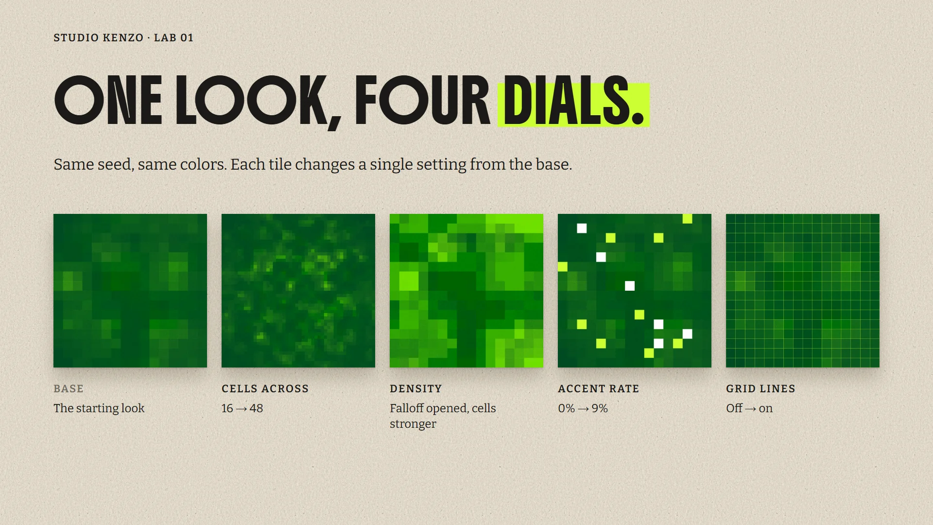
More cells make the pixels smaller and busier. Opening the density fills the frame with stronger color. The accent rate sprinkles in bright lime and white cells. Grid lines turn the mosaic into something closer to graph paper.
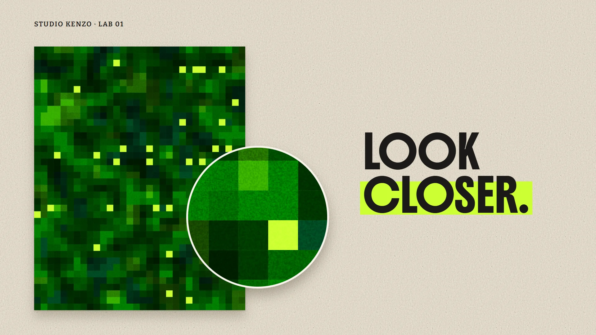
Every file also gets film grain, re-rolled on every frame of a video, just like real film.
The Lab grew as I used it
I didn't plan every control up front. Most of them showed up because I needed them while making the backgrounds.
- Speed. The first loops felt rushed, even at the slowest setting, so I added a speed control and a separate motion strength dial for calmer movement.
- Full frame mosaics. Every composition split the frame into panels. I wanted the pixels to cover everything, so the Lab learned to do that too.
- Clean transparency. The grain was leaving a faint haze over the see-through areas of the overlays. Fixed, so they sit cleanly on any color or photo.
- Cutting what didn't work. A transparent hole inside the title card never behaved. Instead of fighting it, I removed it.
Where it ends up
Backgrounds only matter once they're in use. Because every look exports in four shapes, the same system can fill a website hero, a phone story, a social post and a slide deck without starting over.
The trick is knowing when to step back. Busy pixels fight with text, so behind headlines and buttons I use a calmer loop with bigger cells and a soft shade. The pattern stays alive, and the words stay readable.
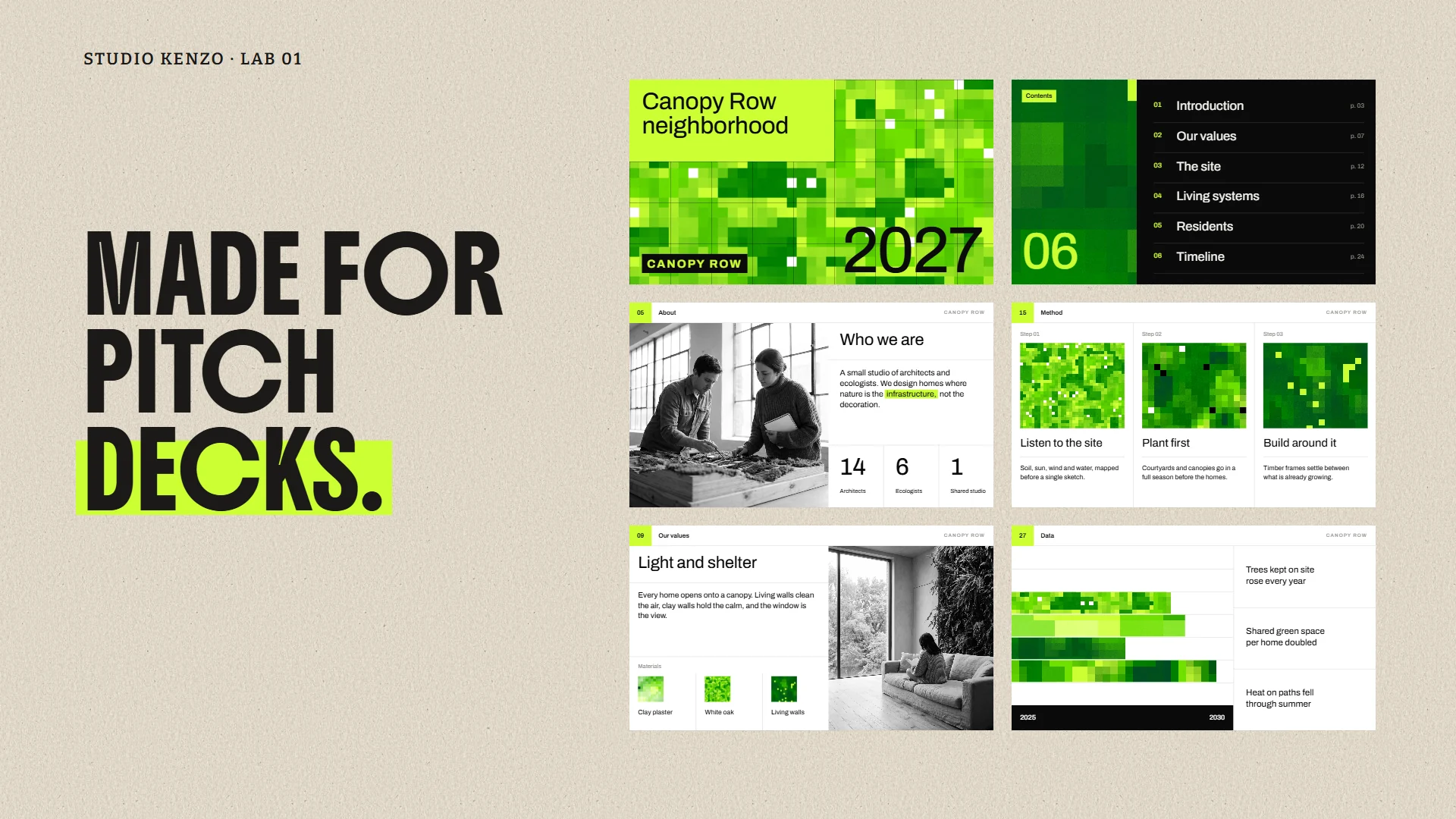
In a presentation, the same stills become covers, section dividers and texture blocks, so a whole deck feels connected without repeating one image.
Who this aesthetic fits
Pixels and grain sit right between digital and organic, which makes this look useful for more industries than you'd expect.
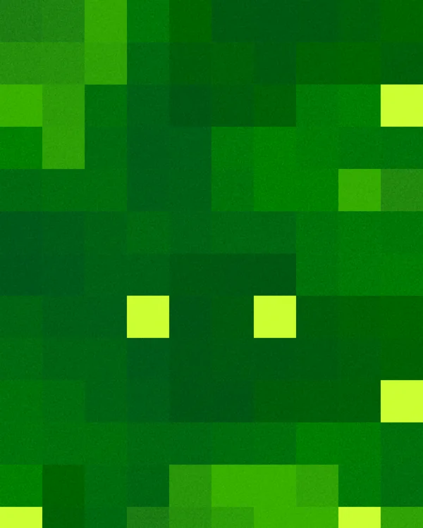
Count
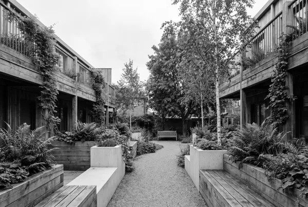
Climate and sustainability
Green without the leaf clichés. Data meets nature.
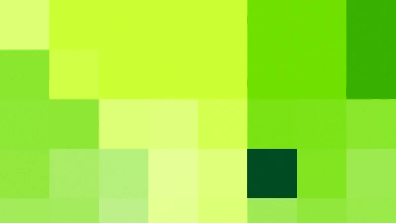
Architecture and urban planning
Grids and site plans already speak this language.
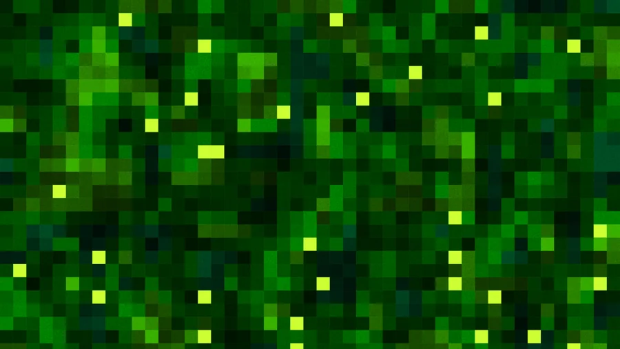
Tech, data and SaaS
Something more alive than a flat gradient behind a product demo.
What I took away
Building the tool turned out to be part of the creative process. Every control I added was a design decision, and from the start I knew the results could live almost anywhere: websites, phone stories, pitch decks, video.
That is what excites me most. I can create endless iterations and still control every one of them. The variety comes from the system, but the taste still comes from me.
Want a tool like this?
If you're curious about building small tools for your own creative work, or want a system like this for your brand, let's talk.
Get in touch